

Who doesn’t love a good makeover?
One Love Organics' new look is a refinement of the existing packaging that expresses their commitment to the quality, integrity and pureness of each product that they produce. We focused creating consistency across our lines, showcasing a strong brand – not three. We gave each line unique but cohesive elements. Taking customer feedback to heart, we endeavored to remove the guesswork of choosing products, making product names easier to read, and creating an easy-to-use icon system. And now, all the products in the new packaging are now CERTIFIED ORGANIC by ECOCERT®.
the Before

Beautiful and unique in it's own right, the packaging has been praised in print magazines, blogs, and customer reviews. With equal parts femininity and playfulness, the products jumped off the shelves and into customers' hearts. We had no desire to compromise on the quality or change the familiar, just update and enhance, with keeping our identity intact.
Pain Points:
- Brand confusion. Product lines appear to be individual brands
- Too cute. Packaging not sophisticated enough for some premium retailers.
- Quality and Value not apparent. Does not reflect the quality or value of the products.
- Buyers (both retailers and customers) don't always understand what makes our products unique.
- Handwritten names are difficult to read at a distance.
- Customer confusion. Too much information on front panel.
- Does not adhere to legal requirements.
The Result
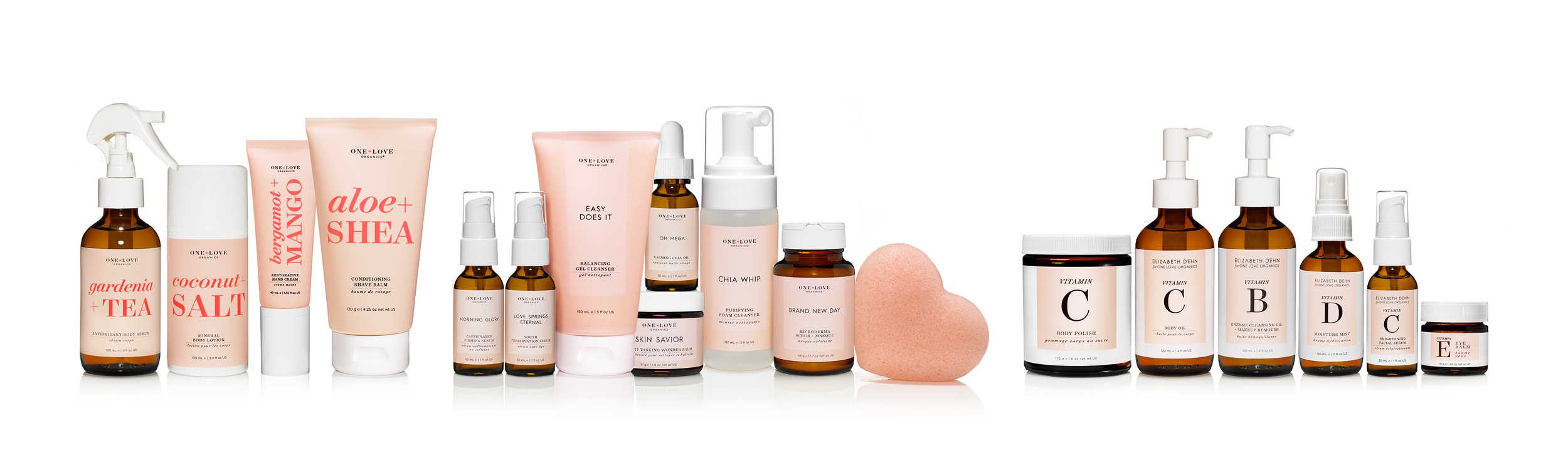
When approaching the redesign, we endeavored to keep the essence of what made the brand in the first place. Our focus for the brand as a whole, was consistency. The first, and the easiest choice was branding our peach, having it transcend across each product line. We wanted our products to showcase a strong brand– not three.

We created an easy to use icon system to remove the guesswork at the point of purchase, increasing sales, and customer confidence and satisfaction.
Our philosophy urges the customer to find what works best for them. Women don't fit into a box, nor should their skincare. Instead of skin-typing, we chose to showcase the benefit, giving the customer the ability to choose what they are seeking.
AS SEEN IN


A DEEPER LOOK


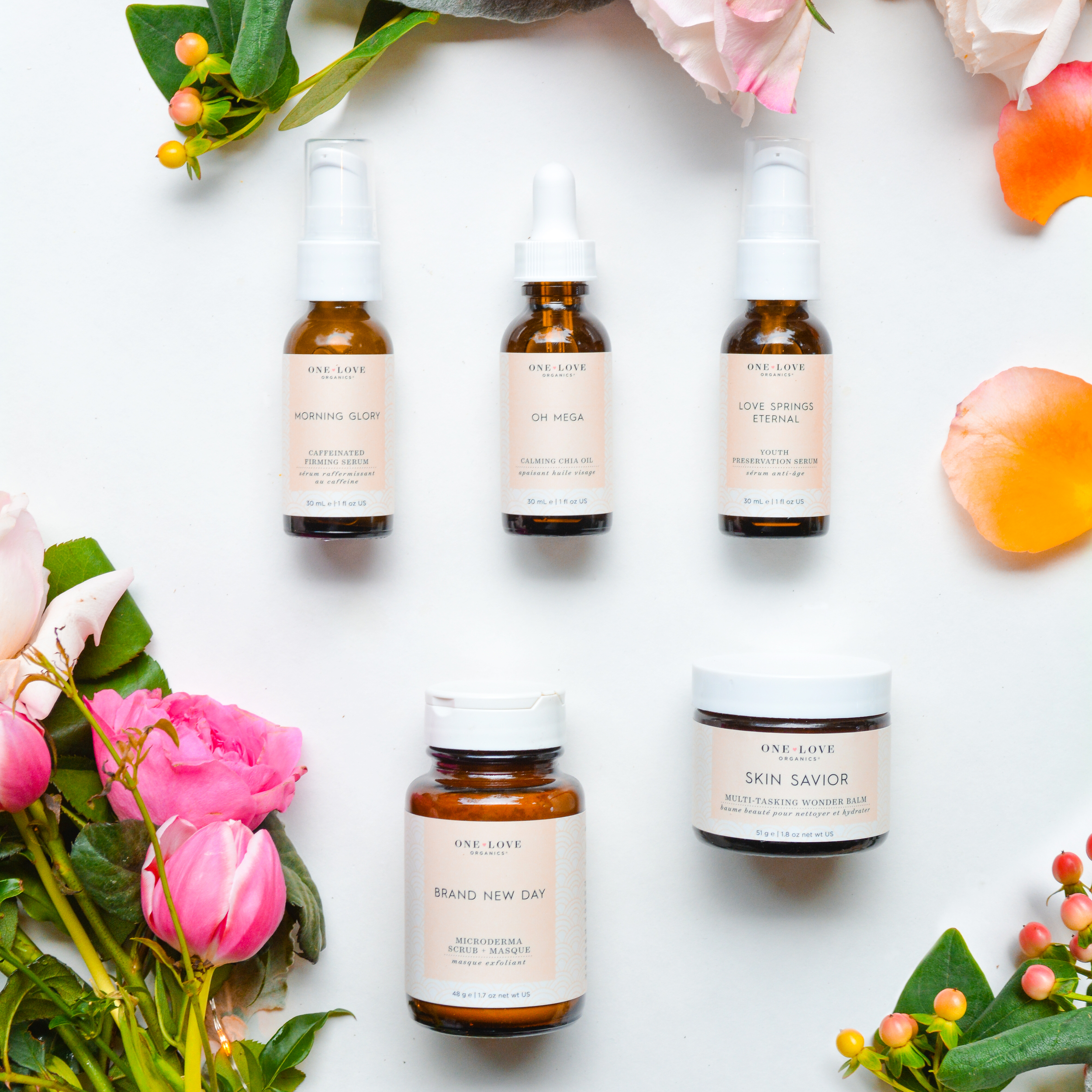
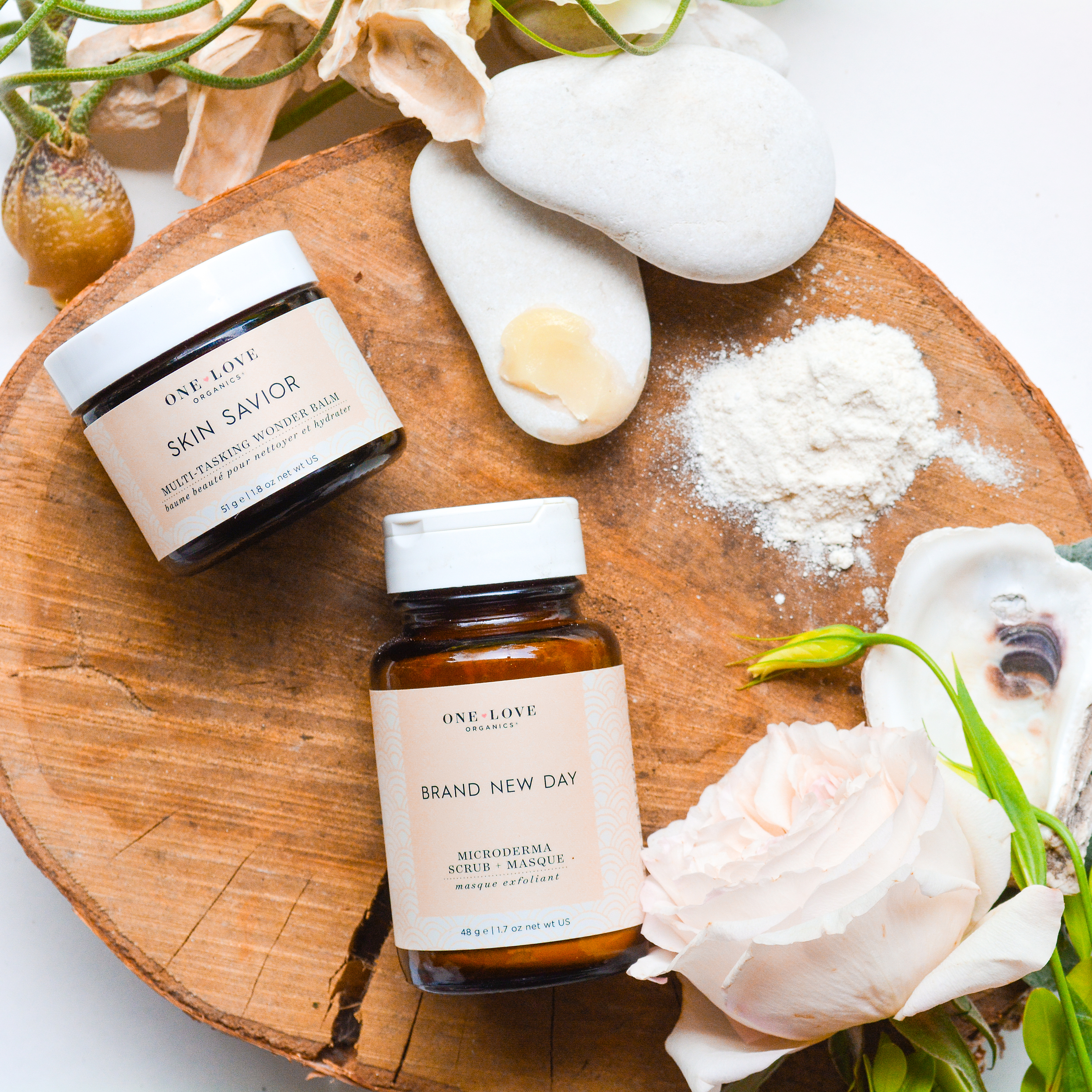
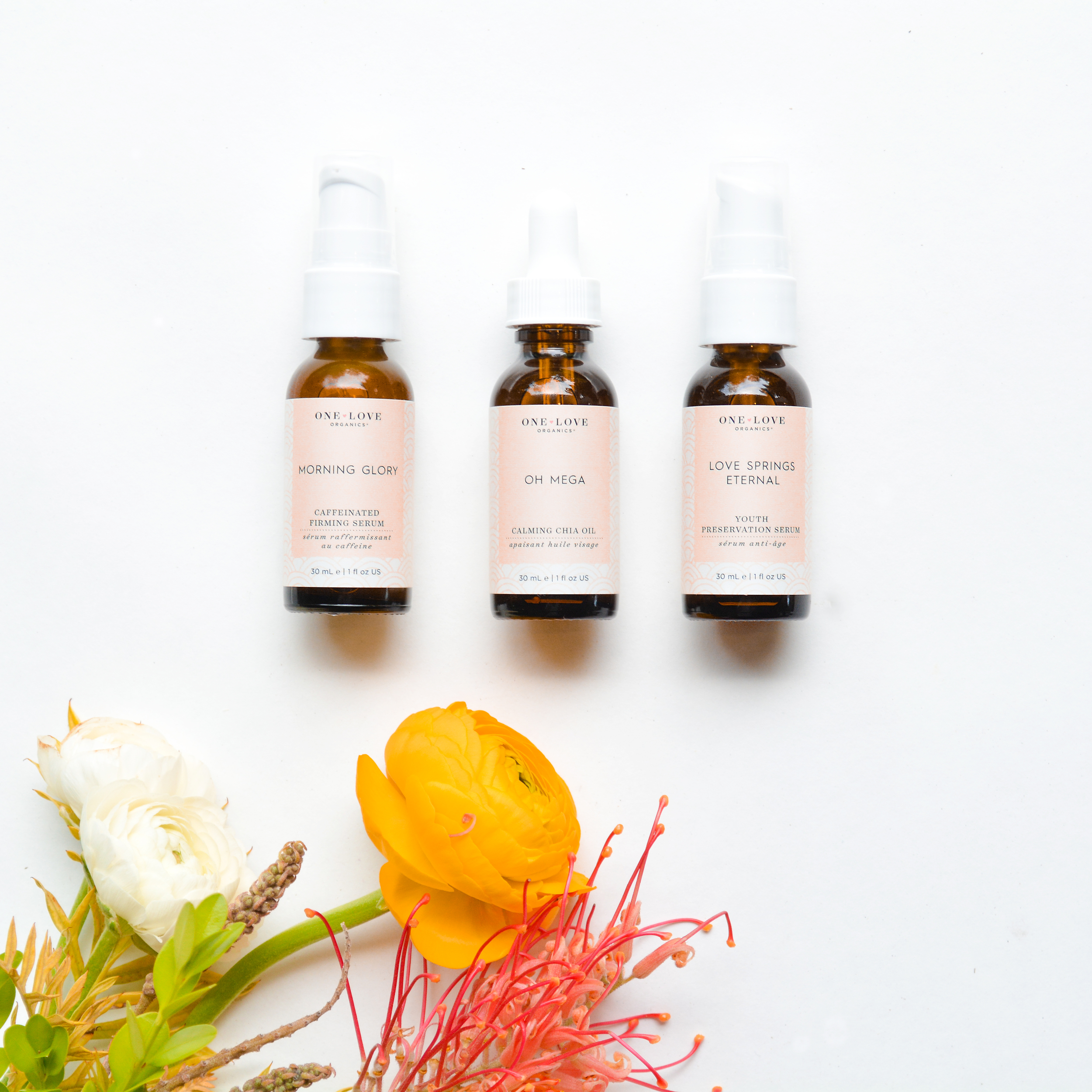
Customers have always connected with the approachability of the brand. The Essentials line is the cornerstone of One Love Organics, with unique names, and superior ingredients.
The original packaging included individually handwritten names and a hand-drawn pattern for each product, lending to the artisinal, handcrafted aspect of the brand. These touches were not always the most practical, with research showing that many people had problems reading the name and identifying what the nature of the product was.
We adopted one of our signature patterns to live across the essentials line. We adjusted the "Sunrise" pattern to be a soothing tone-on-tone, reminiscent of skin. We isolated the name, and pivoted to a Sans-Serif typeface, gave the descriptive name its own, easily recognizable space, and minimized the clutter on the front panel.


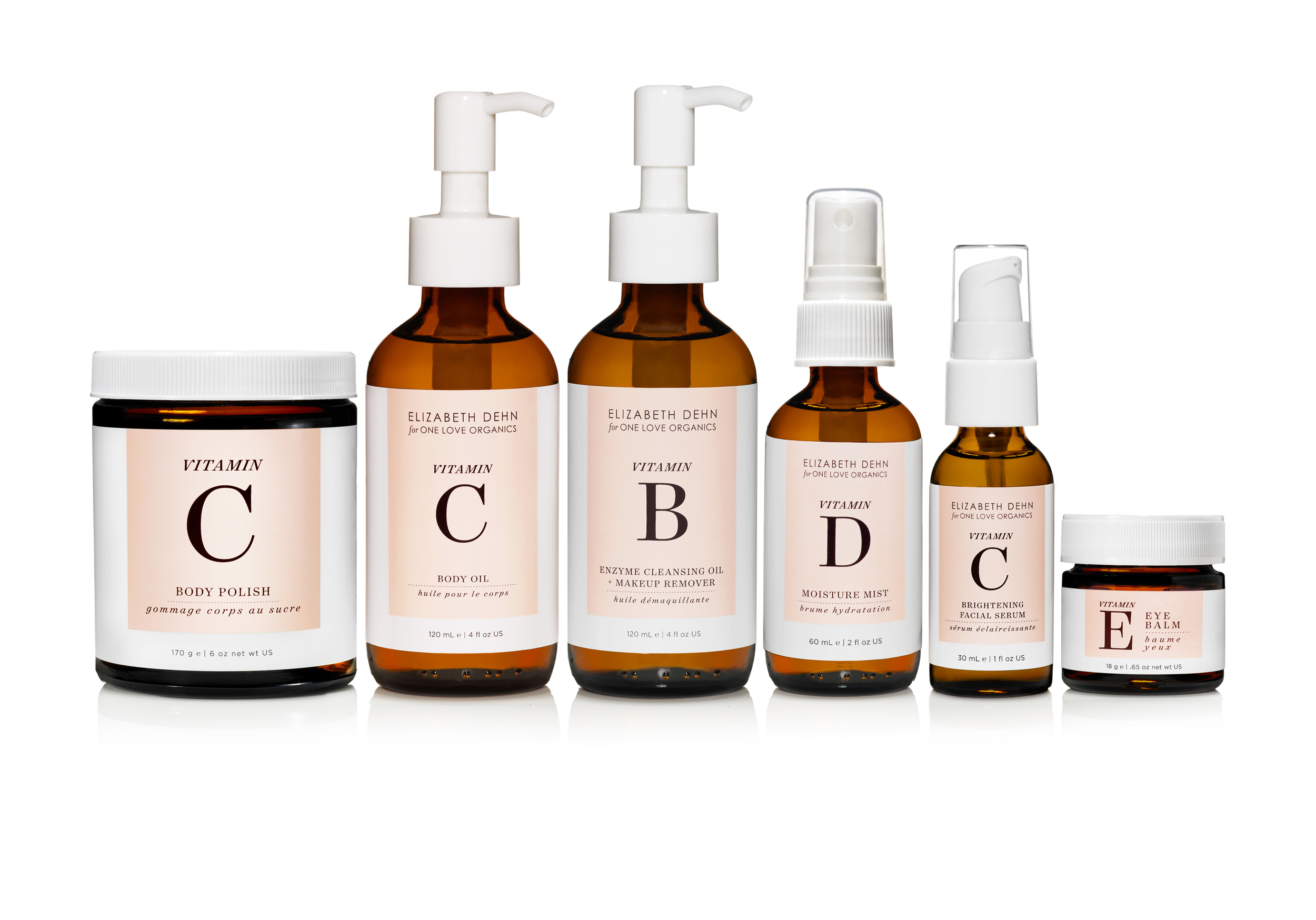
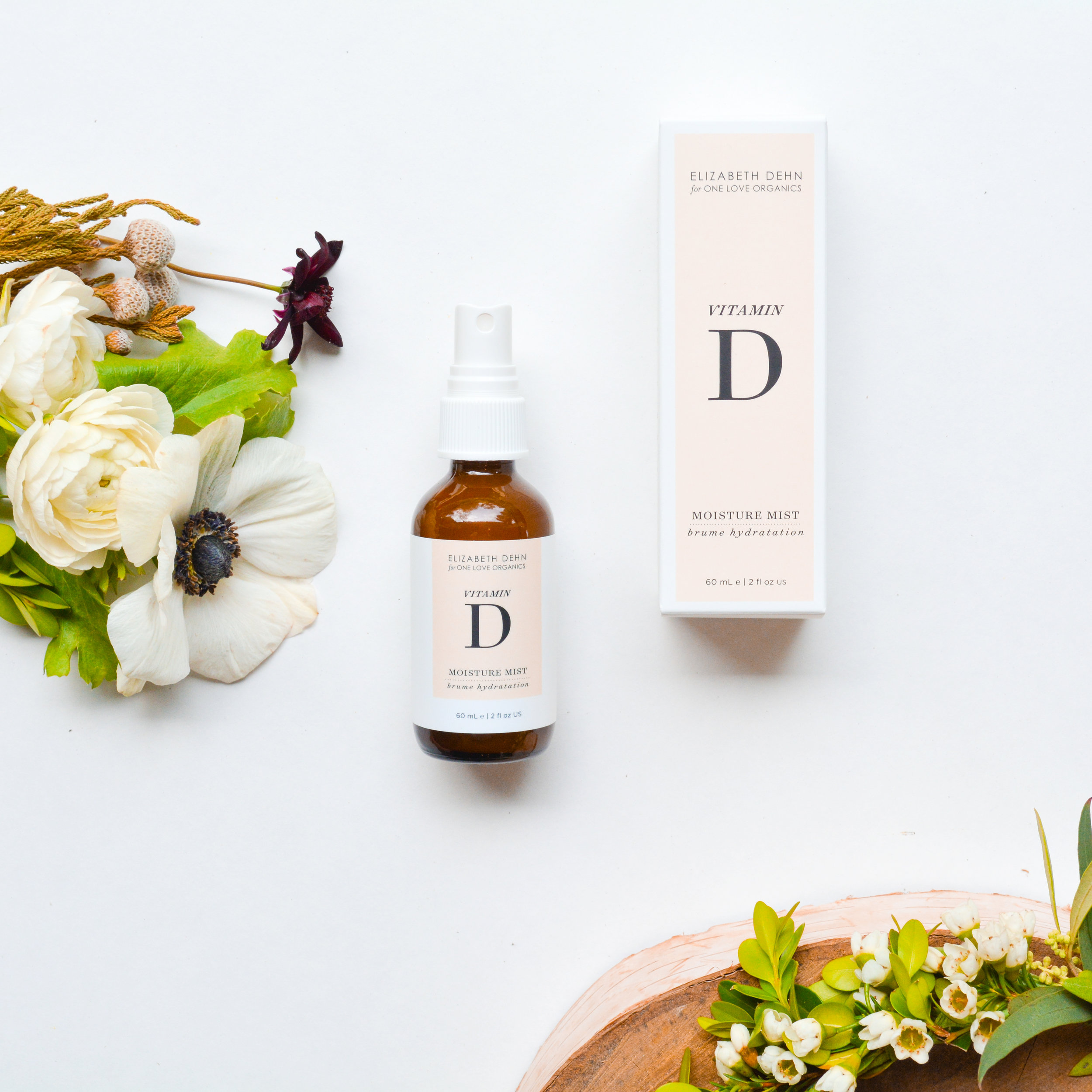
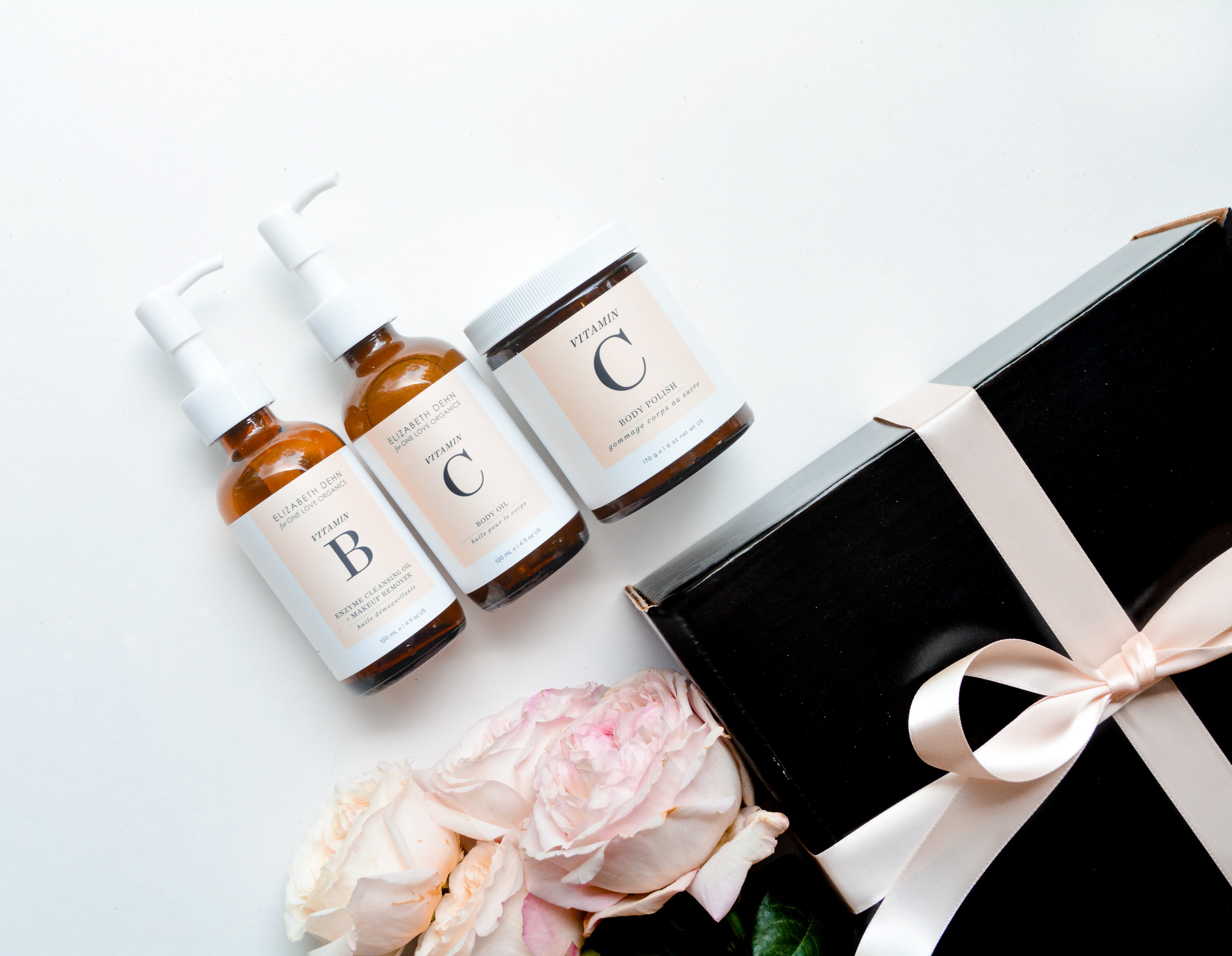
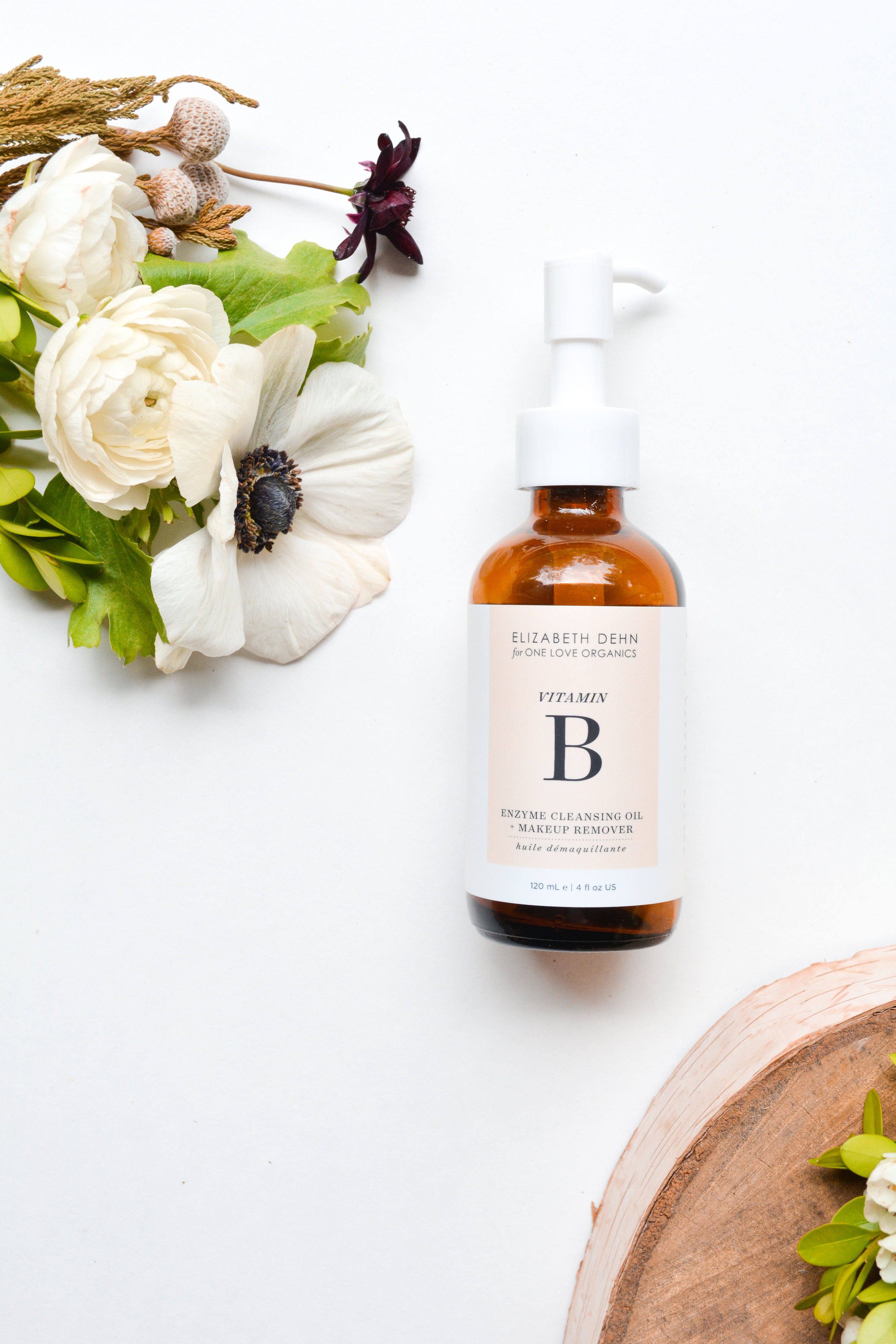
We partnered with our favorite beauty guru, Elizabeth Dehn, founder of the award-winning blog beautybets.com, to create the Vitamin Collection. A treatment line like no other, the Vitamin Collection combines the highest quality vitamins and antioxidants with a moisture-rich base.
With a minimalistic style, and black and white color palette, the original packaging was very much the opposite of the Essentials. While sophisticated, the beauty market is oversaturated with black and white packages. Our own customers were confused with how the line fit in. Was it limited edition?
First, we added our signature peach to the black and white palette. We then highlighted the Vitamin in each product, both for visual interest as well as to highlight our use of superior ingredients, justifying the higher price point.
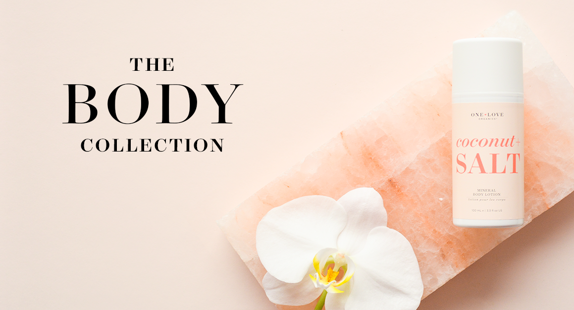


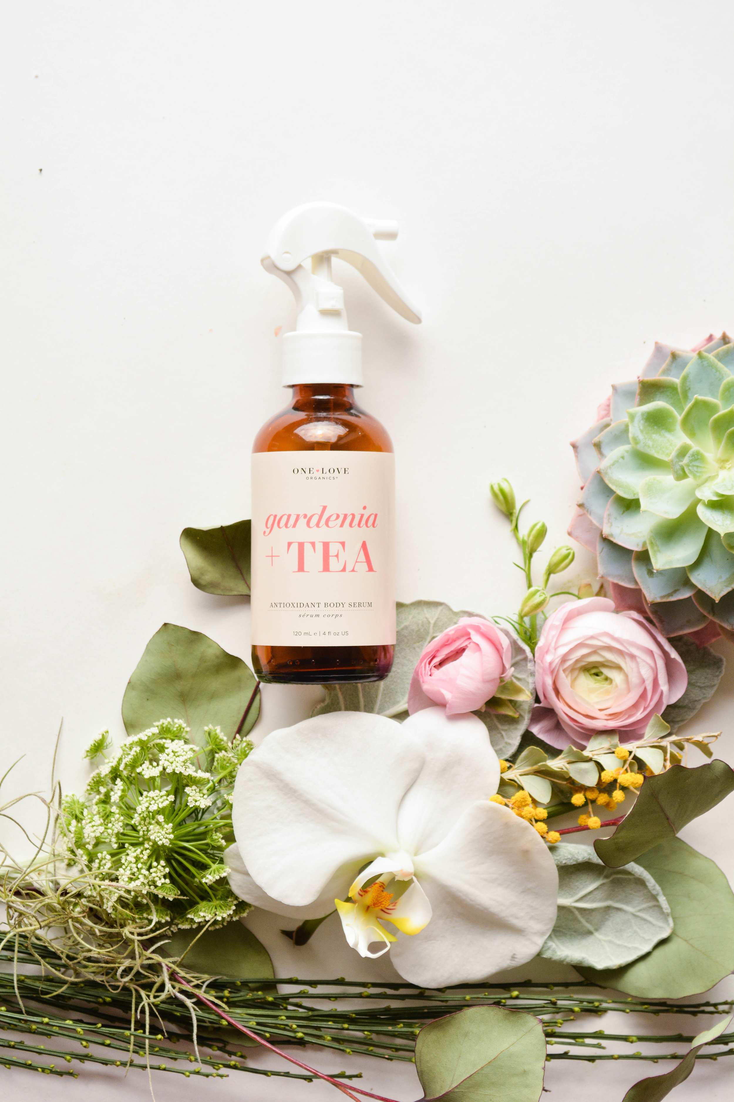
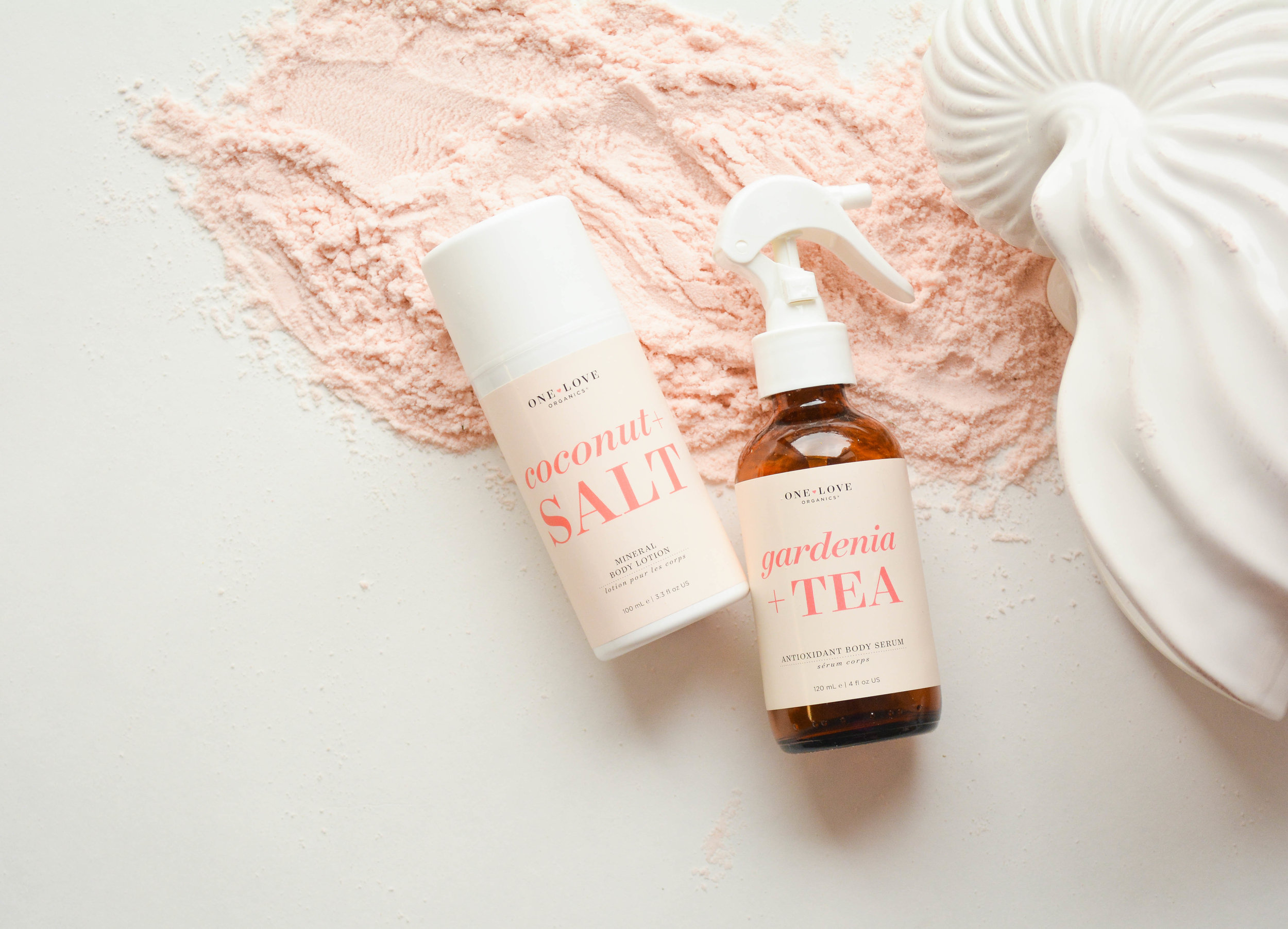
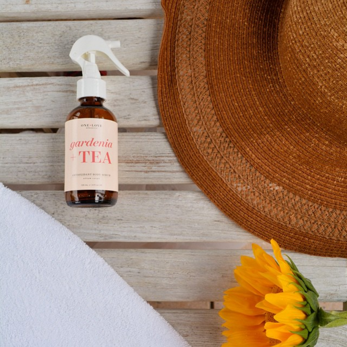
With only one product, the Body Collection has an enormous amount of potential for new products. Body products are ubiquitous, and often offered at a lower price point. We needed to establish this line as a unique, sophisticated, must-have product.
The collection started out with the Daily Body Serum, in 4 scents. Research showed that too many choice can lead to an abandoned sale, and in the case of the Body Serums, it often did. Customers couldn't choose a scent via our website, and opted for cheaper alternatives elsewhere. We deciced to frame the products–and subsequent designs– differently, highlighting the ingredients and what they can do for the customer. We eliminated scents and stuck to our peach, with the focus on each product's key ingredients in the bright coral of our logo.
The designs above are the property of © 2015 ONE LOVE ORGANICS, INC, ALL RIGHTS RESERVED, ONE LOVE ORGANICS® IS A REGISTERED TRADEMARK OF ONE LOVE ORGANICS, INC.